I care about clarity over decoration, impact over noise, and stories over pixels.
These snapshots highlight key moments from each project.
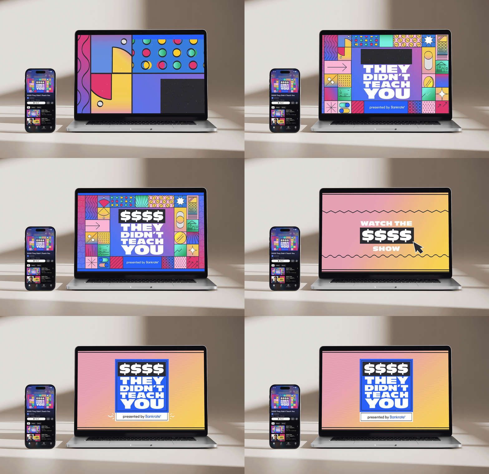
$$$$ They Didn’t Teach You Youtube Series
Context
Bankrate wanted to reach millennials and Gen Z where they actually are and talk to them the way they actually talk. The brief was a YouTube series built around real finance influencers getting honest about their own money mistakes, making financial education feel less like a lecture and more like a conversation.
Execution
I led creative direction across all six episodes plus individual trailers and an overall series trailer. The visual direction was intentionally bold and high energy, designed to stop a Gen Z viewer mid-scroll and feel nothing like traditional financial content. I owned the concept, cover art, and graphic design from start to finish.
Impact
The debut video crossed 1.8 million views and it’s still one of their most watched.
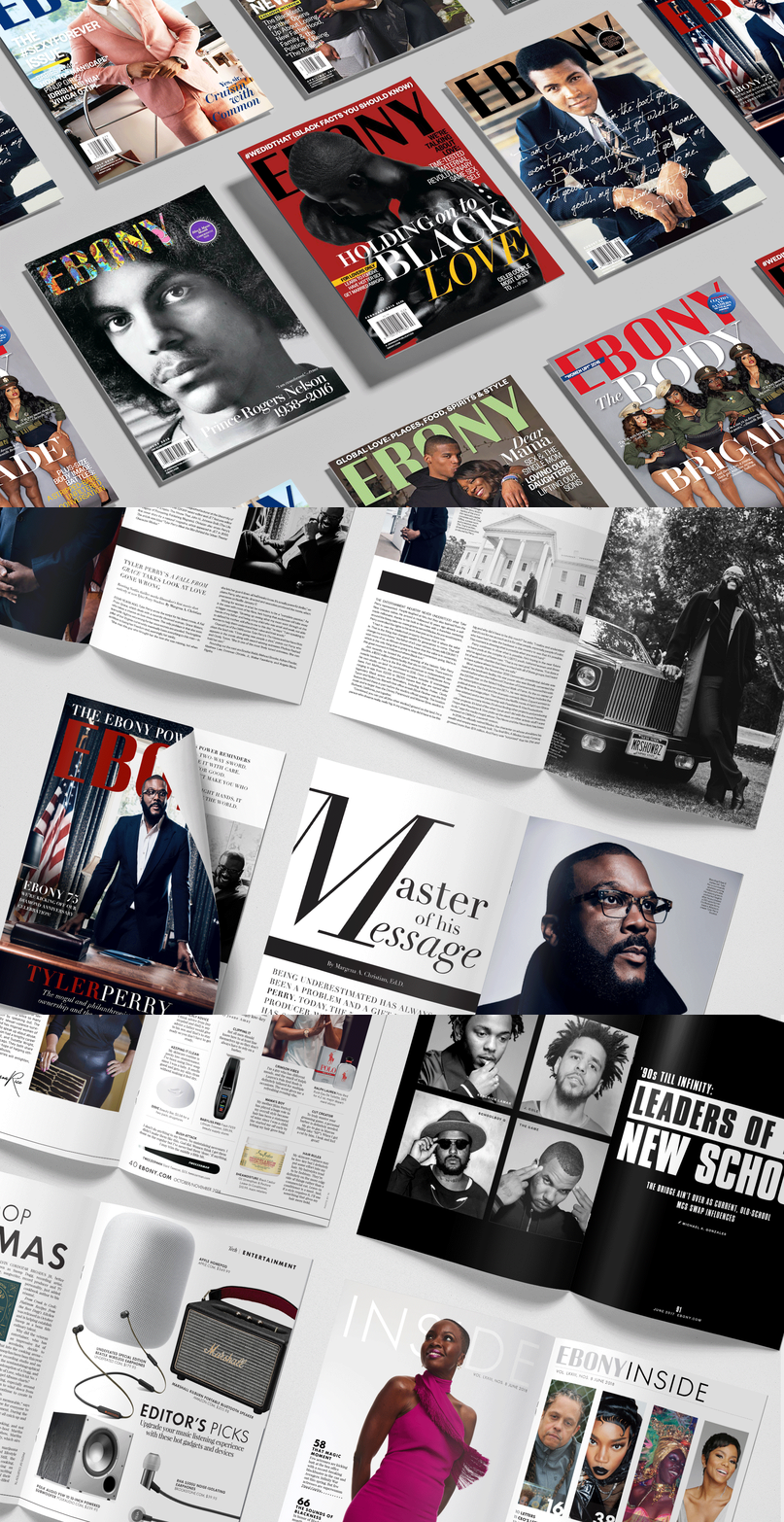
Magazine Covers + Editorial Layouts
Context
Ebony is where I learned what it means to design for a community, not just an audience. Every cover had to earn attention on a newsstand and mean something to the reader who picked it up.
Execution
I art directed covers and editorial layouts where typography wasn’t decorative, it was doing real structural work, and composition was always emotion first, hierarchy second.
Impact
This collection includes directed covers and interior editorial layouts, including what became one of the highest-grossing issues during my time there.
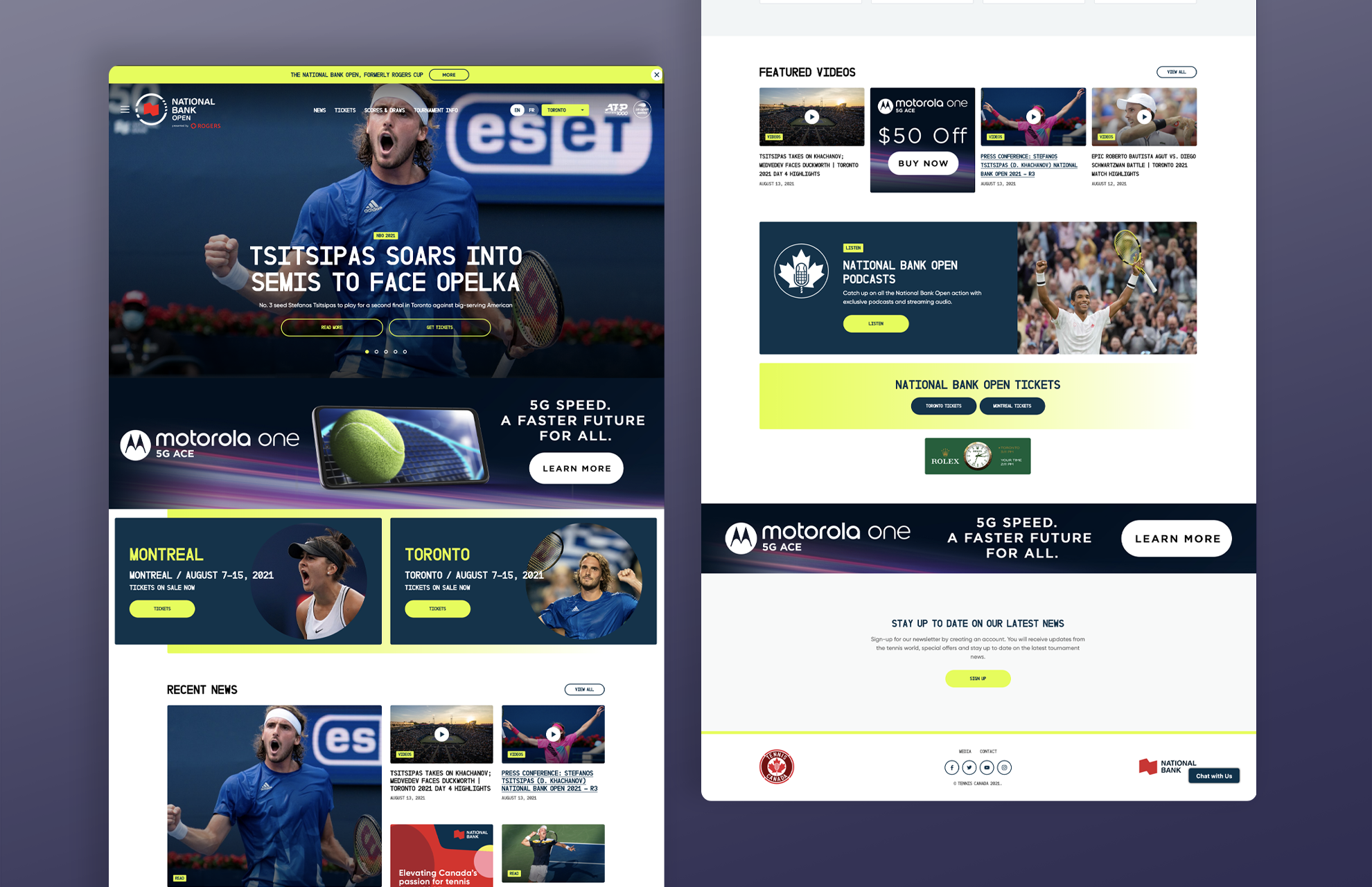
Motorola x National Bank Open Display Ads
Context
Motorola was launching the One 5G Ace and needed display creative that could hold its own in a high-visibility partnership placement on the National Bank Open tennis tournament site.
Execution
I designed a suite of ads that adapted across multiple sizes while keeping the brand sharp and the product front and center. The challenge was making a product launch feel exciting in a format that usually gets ignored.
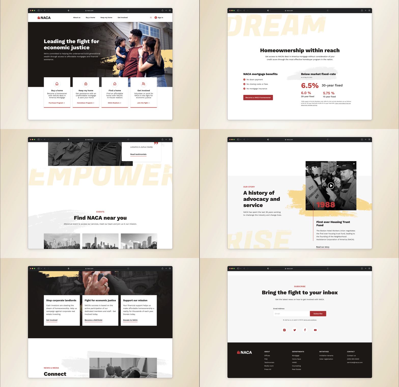
NACA Website Redesign
Context
NACA’s existing site was outdated and hard to navigate, creating friction for the exact people it was trying to serve. As an organization dedicated to making homeownership accessible for working families, their digital experience needed to match the clarity and purpose of their mission.
Execution
Working collaboratively with another designer, I led concepting and wireframing for the full redesign. I took the homepage for both desktop and mobile, the main navigation, and the home purchase page through to final UI. The challenge was delivering something modern and visually fresh without losing the weight and credibility that an organization like NACA needs to earn trust with first-time homebuyers.
Impact
The redesign gave NACA a digital presence that finally felt as purposeful as the work they do, making a complex process feel approachable from the first click.
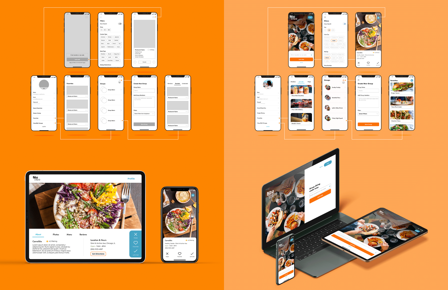
Bite Tribe UX & Visual Design Concept
Context
Bite Tribe started as a personal project to bridge into more UI-centered work and turned into a fully realized product concept. The problem was one I kept running into personally: groups of people who can never agree on where to eat.
Execution
I started with user interviews to identify the real pain points behind group dining decisions, using those insights to shape the core mechanic and information architecture before moving into visual design. From there I built out the complete design system, style guide, and responsive UI for a location-based app where groups swipe on nearby restaurant options and land on a shortlist everyone can agree on. Every design decision was tested against what the research told me users actually needed.
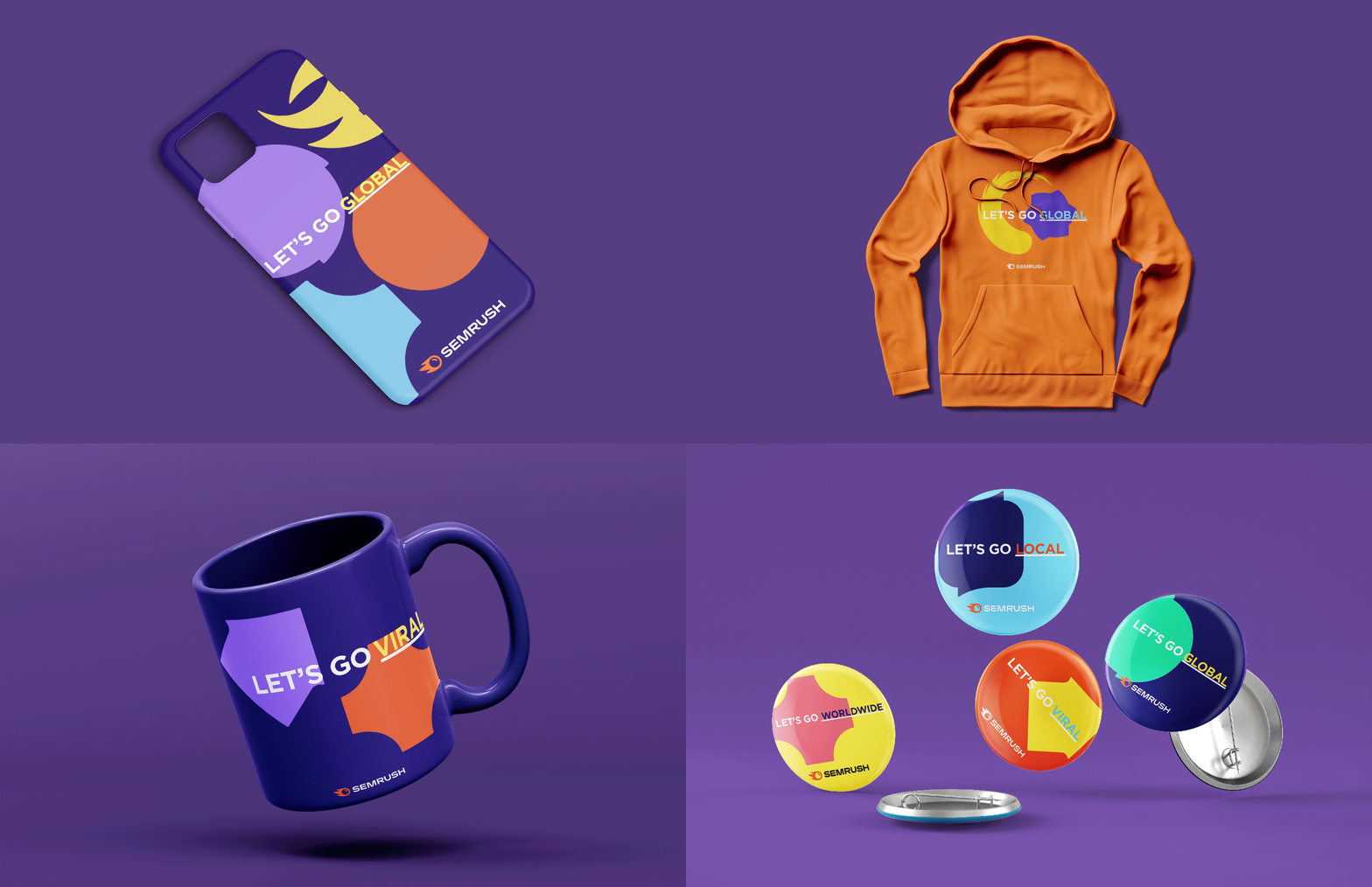
Semrush Branded Merchandise Campaign
Context
The brief was branded merchandise. The real challenge was making it something people actually want to share.
Execution
I concepted a fill-in-the-blank campaign for Semrush built around their core mission of helping brands grow visibility. Recipients complete the phrase with their own objective, turning branded swag into organic social content. Let’s go local. Let’s go viral. Let’s go.
Impact
The concept was built to scale, letting the merch do the marketing long after it left the building.
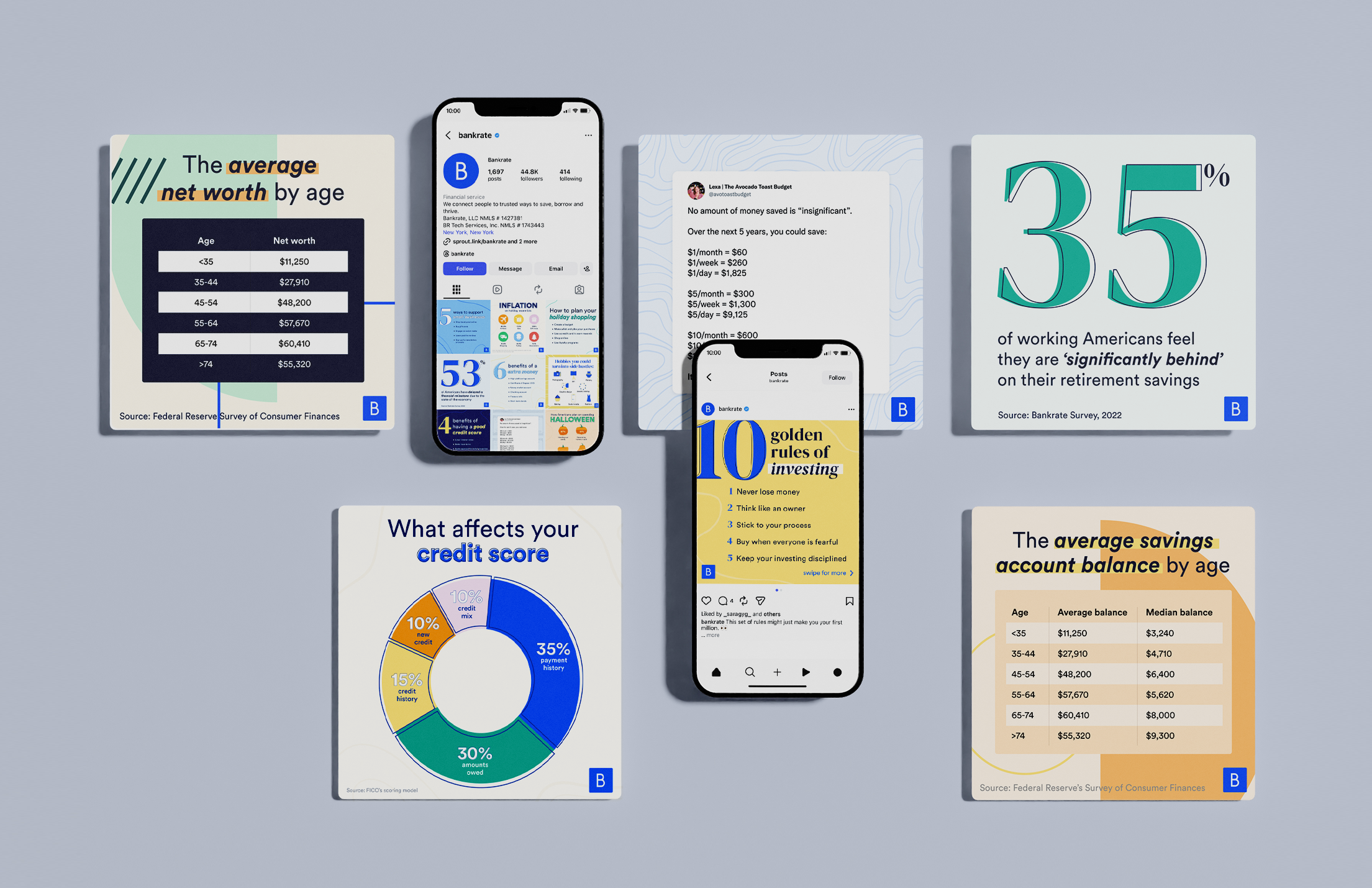
Bankrate Social Media Templates
Context
Bankrate’s organic social had a consistency problem. Different formats, different visual treatments, no clear system tying it together.
Execution
I built a scalable template framework covering their core content types including infographics, statistics, and data-driven posts, so the team could produce consistently on-brand content at volume without starting from scratch every time.
Impact
A repeatable system means the work compounds. Every post after this one had a foundation to build from.
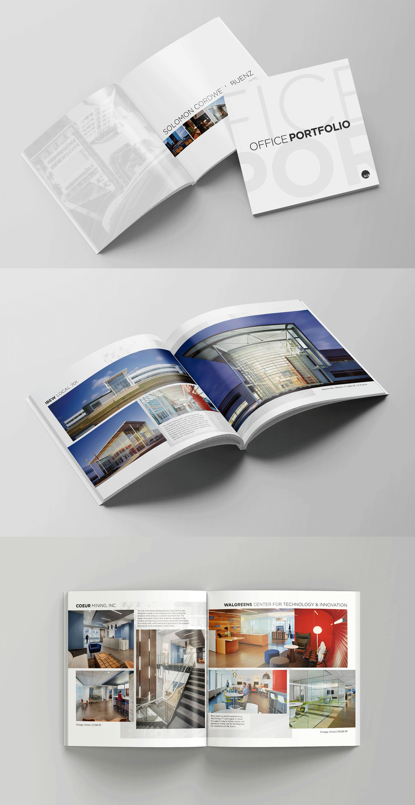
SCB Office Portfolio Brochure
Context
Solomon Cordwell Buenz’s work speaks for itself. The job was making sure the print did too.
Execution
While on staff at SCB I led the office portfolio brochure from start to finish, curating photography, designing the layout, and delivering press-ready files.
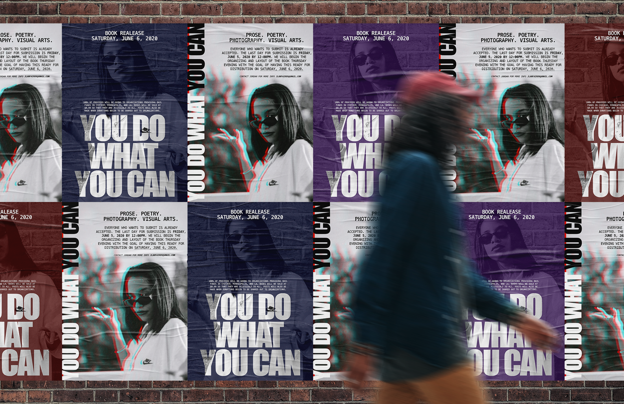
YDWYC Poster Series
Context
You Do What You Can started with a community that had something to say and needed design to help say it.
Execution
I created the artist submission call and book release materials for a curated collection of works by Black creatives, designing work that could hold space for something bigger than itself.
Outcome
Proceeds benefited bail funds across Chicago, Minneapolis, and LA. The design wasn’t the point, but it made the point possible.